https://github.com/xgfe/react-native-datepicker
react native datePicker component for both Android and IOS, useing DatePikcerAndroid, TimePickerAndroid and DatePickerIOS
https://github.com/xgfe/react-native-datepicker
Last synced: about 1 year ago
JSON representation
react native datePicker component for both Android and IOS, useing DatePikcerAndroid, TimePickerAndroid and DatePickerIOS
- Host: GitHub
- URL: https://github.com/xgfe/react-native-datepicker
- Owner: xgfe
- License: mit
- Created: 2016-04-21T11:34:10.000Z (about 10 years ago)
- Default Branch: master
- Last Pushed: 2023-05-05T12:02:07.000Z (about 3 years ago)
- Last Synced: 2025-05-13T12:53:41.734Z (about 1 year ago)
- Language: JavaScript
- Size: 30.3 MB
- Stars: 2,126
- Watchers: 28
- Forks: 725
- Open Issues: 287
-
Metadata Files:
- Readme: README.md
- Changelog: CHANGELOG.md
- License: LICENSE
Awesome Lists containing this project
- awesome-react-native - react-native-datepicker ★1365 - React Native date, datetime and time picker for both Android and IOS (Components / UI)
- awesome-react-native-ui - react-native-datepicker ★306 - React Native date, datetime and time picker for both Android and IOS (Components / UI)
- awesome-react-native - react-native-datepicker ★1365 - React Native date, datetime and time picker for both Android and IOS (Components / UI)
- ReactNativeMaterials - react-native-datepicker
- awesome-react-native - react-native-datepicker ★1365 - React Native date, datetime and time picker for both Android and IOS (Components / UI)
- fucking-awesome-react-native - react-native-datepicker ★1365 - React Native date, datetime and time picker for both Android and IOS (Components / UI)
- awesome-reactnative-ui - react-native-datepicker - native-datepicker/img/react-native-datepicker-android.gif)| (Others)
- awesome-react-native - react-native-datepicker ★1365 - React Native date, datetime and time picker for both Android and IOS* [react-native-tableview ★1105](https://github.com/aksonov/react-native-tableview) - Native iOS TableView wrapper for React Native (Components / UI)
- awesome-reactnative-ui - react-native-datepicker - native-datepicker/img/react-native-datepicker-android.gif)| (Others)
- awesome-humanscape - react-native-datepicker - 날짜를 선택할 수 있는 컴포넌트 (React, React Native / Components)
README
# react-native-datepicker [](https://travis-ci.org/xgfe/react-native-datepicker) [](https://coveralls.io/github/xgfe/react-native-datepicker?branch=master) [](https://img.shields.io/npm/dm/react-native-datepicker.svg) [](https://img.shields.io/npm/dt/react-native-datepicker.svg)
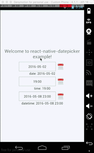
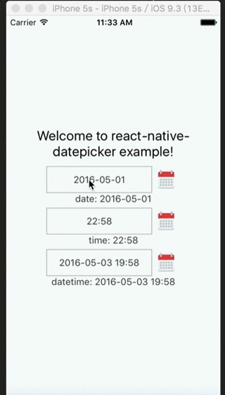
React Native DatePicker component for both Android and iOS, using DatePickerAndroid, TimePickerAndroid and DatePickerIOS
## Install
```bash
npm install react-native-datepicker --save
```
Or using [react-native-ui-xg](https://github.com/xgfe/react-native-ui-xg), our react-naitve ui kit.
```bash
npm install react-native-ui-xg --save
```
## Example
Check [index.android.js](https://github.com/xgfe/react-native-datepicker/blob/master/index.android.js) in the Example.
## Usage
```javascript
import React, { Component } from 'react'
import DatePicker from 'react-native-datepicker'
export default class MyDatePicker extends Component {
constructor(props){
super(props)
this.state = {date:"2016-05-15"}
}
render(){
return (
{this.setState({date: date})}}
/>
)
}
}
```
You can check [index.js](https://github.com/xgfe/react-native-datepicker/blob/master/index.android.js) in the Example for detail.
## Properties
| Prop | Default | Type | Description |
| :------------ |:---------------:| :---------------:| :-----|
| style | - | `object` | Specify the style of the DatePicker, eg. width, height... |
| date | - | string | date | Moment instance | Specify the display date of DatePicker. `string` type value must match the specified format |
| mode | 'date' | `enum` | The `enum` of `date`, `datetime` and `time` |
| androidMode | 'default' | `enum` | The `enum` of `default`, `calendar` and `spinner` (only Android) |
| format | 'YYYY-MM-DD' | `string` | Specify the display format of the date, which using [moment.js](http://momentjs.com/). The default value change according to the mode. |
| confirmBtnText | '确定' | `string` | Specify the text of confirm btn in ios. |
| cancelBtnText | '取消' | `string` | Specify the text of cancel btn in ios. |
| iconSource | - | {uri: string} | number | Specify the icon. Same as the `source` of Image, always using `require()` |
| minDate | - | string | date | Restricts the range of possible date values. |
| maxDate | - | string | date | Restricts the range of possible date values. |
| duration | 300 | `number` | Specify the animation duration of datepicker.|
| customStyles | - | `object` | The hook of customize datepicker style, same as the native style. `dateTouchBody`, `dateInput`...|
| showIcon | true | `boolean` | Controller whether or not show the icon |
| hideText | false | `boolean` | Controller whether or not show the `dateText` |
| iconComponent | - | `element` | Set the custom icon |
| disabled | false | `boolean` | Controller whether or not disable the picker |
| is24Hour | - | `boolean` | Set the TimePicker is24Hour flag. The default value depend on `format`. Only work in Android |
| allowFontScaling | true | `boolean` | Set to false to disable font scaling for every text component |
| placeholder | '' | `string` | The placeholder show when this.props.date is falsy |
| onDateChange | - | `function` | This is called when the user confirm the picked date or time in the UI. The first and only argument is a date or time string representing the new date and time formatted by [moment.js](http://momentjs.com/) with the given format property. |
| onOpenModal | - | `function` | This is called when the DatePicker Modal open. |
| onCloseModal | - | `function` | This is called when the DatePicker Modal close |
| onPressMask | - | `function` | This is called when clicking the ios modal mask |
| modalOnResponderTerminationRequest | - | `function` | Set the callback for React Native's [Gesture Responder System](https://facebook.github.io/react-native/docs/gesture-responder-system.html#responder-lifecycle)'s call to `onResponderTerminationRequest`. By default this will reject a termination request, but can be overidden in case the View under the Modal is implementing custom gesture responders, and you wish for those to be overidden in certain cases. |
| TouchableComponent | `TouchableHighlight` | `Component` | Replace the `TouchableHighlight` with a custom `Component`. For example : `TouchableOpacity` |
| getDateStr | - | Function | A function to override how to format the date into a `String` for display, receives a `Date` instance
### Property `customStyles` available keys
* appearance: `dateInput`, `disabled`, `dateTouchBody`, `dateIcon`, `placeholderText`, `dateText`
* ios select panel: `datePickerCon`, `datePicker`, `btnConfirm`, `btnTextConfirm`, `btnCancel`, `btnTextCancel`
## Instance Methods
| Method | Params | Description |
| :------------ |:---------------:| :---------------:|
| onPressDate | - | Manually open the date picker panel |
| onPressCancel | - | Manually close the date picker panel like, similarly pressing cancel btn |