https://github.com/xiaomsh/fluttercitypicker
:fire::fire::fire::+1: 城市选择,地址选择,实时请求数据,多项自定义配置,仿京东样式
https://github.com/xiaomsh/fluttercitypicker
address city citypicker picker
Last synced: 5 months ago
JSON representation
:fire::fire::fire::+1: 城市选择,地址选择,实时请求数据,多项自定义配置,仿京东样式
- Host: GitHub
- URL: https://github.com/xiaomsh/fluttercitypicker
- Owner: xiaomsh
- License: bsd-2-clause
- Created: 2021-03-11T06:10:53.000Z (about 5 years ago)
- Default Branch: master
- Last Pushed: 2025-02-11T03:47:50.000Z (over 1 year ago)
- Last Synced: 2025-10-23T02:54:26.167Z (8 months ago)
- Topics: address, city, citypicker, picker
- Language: Dart
- Homepage:
- Size: 15.6 MB
- Stars: 35
- Watchers: 2
- Forks: 15
- Open Issues: 2
-
Metadata Files:
- Readme: README.md
- Changelog: CHANGELOG.md
- License: LICENSE
Awesome Lists containing this project
README
### 地址选择器
[](https://pub.dev/packages/flutter_city_picker)
[](https://github.com/wenchaosong/FlutterCityPicker)
由于地址选择的数据来源会更新,为了统一,在后台配置一份城市数据,前端获取,否则各个平台都配置一份数据,维护会很麻烦,而且有可能每个平台城市的数据结构都不一样。
本库就是由此而来,数据从后台实时获取,只要解析成固定的数据结构就可以
新版本 2.2.0 支持读取本地文件,但是不建议,因为会增加包体积,而且还要维护,因为有人提的多,所以在此给个 demo
### Demo
[web 预览](https://xiaomsh.github.io/FlutterCityPicker/)
[](https://github.com/wenchaosong/FlutterCityPicker/releases/download/v2.1.1/app-release.apk)
#### 导入方式
```
dependencies:
flutter_city_picker: ^2.2.0
```
#### 使用方法
1. 简单使用
```
CityPicker.show(context: context, cityPickerListener: this);
```
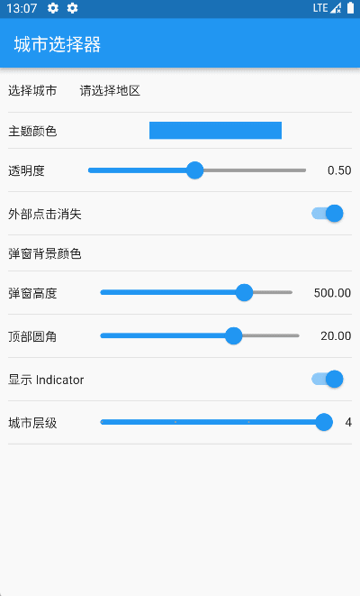
2. 多配置的使用
```
CityPicker.show(
context: context,
// 动画控制器
animController: _animationController,
// 背景透明度
opacity: 0.5,
// 点击外部是否消失
dismissible: true,
// 高度
height: 400,
// 标题高度
titleHeight: 50,
// 顶部圆角
corner: 20,
// 背景颜色
backgroundColor: Colors.white
// 距离左边的间距
paddingLeft: 15,
// 标题组件
titleWidget: Container(
padding: EdgeInsets.only(left: 15),
child: Text(
'请选择地址',
style: TextStyle(
color: Colors.black54,
fontSize: 18,
fontWeight: FontWeight.bold,
),
),
),
// 选择文字
selectText: "请选择",
// 关闭图标组件
closeWidget: Icon(Icons.close),
// tab 高度
tabHeight: 40,
// 是否显示指示器
showTabIndicator: _showTabIndicator,
// tab 间隔
tabPadding: 15,
// tab 指示器颜色
tabIndicatorColor: Theme.of(context).primaryColor,
// tab 指示器高度
tabIndicatorHeight: 2,
// tab 字体大小
labelTextSize: 15,
// tab 选中的字体颜色
selectedLabelColor: Theme.of(context).primaryColor,
// tab 未选中的字体颜色
unselectedLabelColor: Colors.black54,
// 列表 item 头部高度
itemHeadHeight: 30,
// 列表 item 头部背景颜色
itemHeadBackgroundColor: Colors.white,
// 列表 item 头部分割线颜色
itemHeadLineColor: Colors.black,
// 列表 item 头部分割线高度
itemHeadLineHeight: 0.1,
// 列表 item 头部文字样式
itemHeadTextStyle: TextStyle(fontSize: 15, color: Colors.black),
// 列表 item 高度
itemHeight: 40,
// 索引组件宽度
indexBarWidth: 28,
// 索引组件 item 高度
indexBarItemHeight: 20,
// 索引组件背景颜色
indexBarBackgroundColor: Colors.black12,
// 索引组件文字样式
indexBarTextStyle: TextStyle(fontSize: 14, color: Colors.black54),
// 列表选中的图标组件
itemSelectedIconWidget:
Icon(Icons.done, color: Theme.of(context).primaryColor, size: 16),
// 列表选中的文字样式
itemSelectedTextStyle: TextStyle(
fontSize: 14,
fontWeight: FontWeight.bold,
color: Theme.of(context).primaryColor),
// 列表未选中的文字样式
itemUnSelectedTextStyle: TextStyle(fontSize: 14, color: Colors.black54),
// 初始默认地址
initialAddress: _selectedAddress,
cityPickerListener: this,
);
```
3. 监听事件
```
<你的组件> implements CityPickerListener
@override
Future> onDataLoad(int index, T data) async {
return 返回城市数据;
}
@override
void onFinish(List data) {
// 最终回调,返回省市区的代码和名称
}
```
#### 待优化
无
欢迎提 PR 或者 ISSUE