https://github.com/yako-dev/flutter-settings-ui
Create native settings for Flutter app in a minutes.
https://github.com/yako-dev/flutter-settings-ui
adaptive android dart flutter flutter-package ios mobile settings ui ui-components widget
Last synced: 7 months ago
JSON representation
Create native settings for Flutter app in a minutes.
- Host: GitHub
- URL: https://github.com/yako-dev/flutter-settings-ui
- Owner: yako-dev
- License: apache-2.0
- Created: 2019-12-04T10:13:22.000Z (about 6 years ago)
- Default Branch: master
- Last Pushed: 2023-12-05T18:49:46.000Z (about 2 years ago)
- Last Synced: 2025-04-14T16:56:52.153Z (8 months ago)
- Topics: adaptive, android, dart, flutter, flutter-package, ios, mobile, settings, ui, ui-components, widget
- Language: Dart
- Homepage: https://pub.dev/packages/settings_ui
- Size: 16.9 MB
- Stars: 927
- Watchers: 14
- Forks: 235
- Open Issues: 25
-
Metadata Files:
- Readme: README.md
- Changelog: CHANGELOG.md
- License: LICENSE
Awesome Lists containing this project
README
# Settings UI for Flutter
[](https://pub.dev/packages/settings_ui)
## Overview:
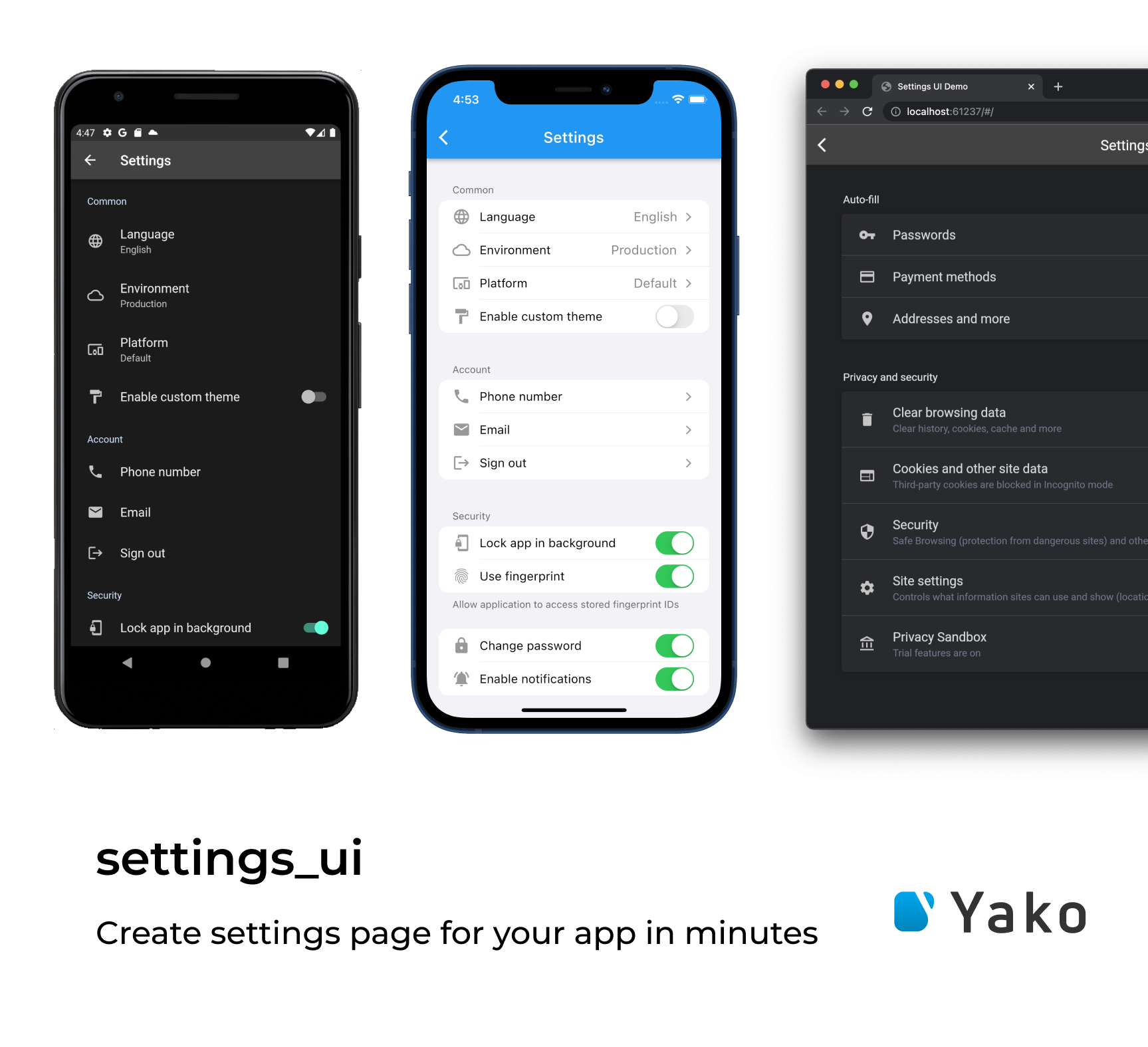
Build the beautiful settings screen UI in one moment with `Settings UI for Flutter`

## Installing:
1. Add the dependency in your `pubspec.yaml` file.
```yaml
dependencies:
settings_ui:
```
2. Import the `settings_ui` package.
```dart
import 'package:settings_ui/settings_ui.dart';
```
## Basic Usage:
```dart
SettingsList(
sections: [
SettingsSection(
title: Text('Common'),
tiles: [
SettingsTile.navigation(
leading: Icon(Icons.language),
title: Text('Language'),
value: Text('English'),
),
SettingsTile.switchTile(
onToggle: (value) {},
initialValue: true,
leading: Icon(Icons.format_paint),
title: Text('Enable custom theme'),
),
],
),
],
),
```
## Settings List
Settings list it's a wrapper for your settings UI.
### Parameters
| Parameter | Description | Required |
|--|--|--|
| List\ sections | The list of your settings sections | +
| bool shrinkWrap | Enable/disable the shrink wrap for the list | -
| ScrollPhysics physics | Setup your custom scroll physics | -
| DevicePlatform platform | Chose the platform view you prefer | -
| SettingsThemeData lightTheme | Setup your light theme | -
| SettingsThemeData darkTheme | Setup your dark theme | -
| Brightness brightness | Overwrite the brightness you want | -
| EdgeInsetsGeometry contentPadding | Set custom paddings | -
| ApplicationType applicationType | Setup the application type you use: the material for MaterialApp, the cupertino for CupertinoApp, and the `both`, if you running the MaterialApp and the CupertinoApp depending on the device's OC | -
## Settings Section
The Setting section is the block of your settings tiles located in your `SettingsList`.
### Implementations
| Type | Description |
|--|--|
| AbstractSettingsSection | An abstract entity. Just an OOP's thing (so you can expand it yourself) |
| CustomSettingsSection | You asked a lot. We implemented this for you. Now you can put anything you want as a child inside this custom section. Just paste the image of your cat or the weather widget inside the `SettingsList`. Feel free and enjoy |
| SettingsSection | The default section widget, contains `Widget title`, `EdgeInsetsDirectional margin` and the required list of `AbstractSettingsTile` we called `tiles` |
## Settings Tile
Here it is. The section tile. It displays the elements you want to show.
| Type | Description |
|--|--|
| AbstractSettingsTile | One more OOP's thing (so you can expand it yourself) |
| CustomSettingsTile | The main idea is the same as for the `CustomSettingsSection`. You can put anything as a child inside your `SettingsSection`.
| SettingsTile | I think that we need to discuss this deeper. See below for the details.
### Settings tile
The implementation of `AbstractSettingsTile`. It has a lot of fabric methods and parameters. Let's
take a look.
| Constructor / Fabric method | Description |
|--|--|
| SettingsTile | Displays the default setting tile. Nothing special. |
| SettingsTile.navigation | Created to indicate this tile as a navigation tile. It adds a right-located arrow for the iOS design as an example.
| SettingsTile.switchTile | Creates a switch tile. Do you want some switch? Just use this one. |
#### Now let's deal with all these parameters.
| Parameter | Description |
|--|--|
| Widget leading | Adds some leading for your tile. Just like with the `ListTile`. |
| Widget trailing | Adds some trailing for your tile. Just like with the `ListTile`. |
| Widget title | The title of your tile.|
| Widget description | Additional info about this tile. Displays different ways according to the platform
| Function(BuildContext context) onPressed | More interactivity for your tiles. Just tap it.
| Color activeSwitchColor | Set the switch color for your `SettingsTile.switchTile`
| Widget value | Just like the `description` but more declarative. You can compare and choose which exactly you want to use.
| Function(bool value) onToggle | Override the on switch event in your `SettingsTile.switchTile`
| bool initialValue | Choose the initial value for your `SettingsTile.switchTile`
| bool enabled | Mark your tile as disabled. It's pretty easy!
## License
This project is licensed under the Apache License 2.0 - see the [LICENSE](LICENSE) file for details