https://github.com/yayoc/react-textfield
Elegant text filed of React Component
https://github.com/yayoc/react-textfield
component demo input npm props react storybook textfield
Last synced: about 1 year ago
JSON representation
Elegant text filed of React Component
- Host: GitHub
- URL: https://github.com/yayoc/react-textfield
- Owner: yayoc
- License: mit
- Created: 2017-01-21T08:45:33.000Z (over 9 years ago)
- Default Branch: master
- Last Pushed: 2017-07-17T13:03:34.000Z (almost 9 years ago)
- Last Synced: 2025-03-18T20:41:28.124Z (over 1 year ago)
- Topics: component, demo, input, npm, props, react, storybook, textfield
- Language: JavaScript
- Size: 879 KB
- Stars: 7
- Watchers: 2
- Forks: 1
- Open Issues: 1
-
Metadata Files:
- Readme: README.md
- License: LICENSE
Awesome Lists containing this project
README
# react-textfield
[](https://badge.fury.io/js/react-textfield)
[](https://travis-ci.org/yayoc/react-textfield)
[](https://opensource.org/licenses/MIT)
[](https://nodei.co/npm/react-textfield/)
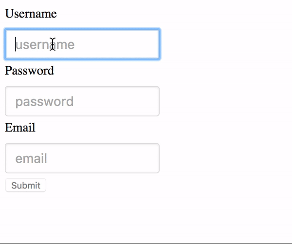
> Elegant textfield of React Component.
## Live Playground
For examples of the react-textfield in action, go to http://blog.yayoc.com/react-textfield.
OR
To run that demo on your own computer:
* Clone this repository
* `npm install`
* `npm run storybook`
* Visit http://localhost:9001/
## Getting Started
#### Install dependencies
Ensure packages are installed with correct version numbers by running:
```sh
(
export PKG=react-textfield;
npm info "$PKG" peerDependencies --json | command sed 's/[\{\},]//g ; s/: /@/g; s/ *//g' | xargs npm install --save "$PKG"
)
```
Which produces and runs a command like:
```sh
npm install --save react-textfield
```
#### Include component
```js
import { TextField, validator } from 'react-textfield';
```
#### Make some elegant textfield
```jsx
```
## API
We have one component and validators for all of your textfield needs.
### `ReactTextField`
This `controlled components` is designed to make input textfield with some messages easily.
We will make accessible and convenient form for end-users by showing appropriate success or error messages.
#### `props`
**Type:**
This props will pass as a type attribute of Input tag.
```js
type: PropTypes.oneOf([
'text',
'password',
'email',
'tel',
'url',
])
```
**Name:**
This props will pass as a name attribute of Input tag.
**If you are using multiple components, This props must be unique.**
**Validators:**
This props is array of `validator object` which contains both `error message` and `handler` as properties.
Args of the handler is *string value* ( text field value ), Return value is *boolean type*.
You can set validator from utilities, or register custom validator by yourself.
Indeed, it is possible to confirm validator methods provided [here](#-validators-).
About using custom validater, please check [example](#examples).
```js
// One of Error object includes validater and error message.
validators: PropTypes.arrayOf(React.PropTypes.shape({
message: PropTypes.string.isRequired,
validator: PropTypes.func.isRequired,
})),
```
**Placehodler:**
This props will pass as placeholder attribute of Input tag.
**successMessage:**
The success message will appear when validation is passed.
Unless you set this props, success message will not appear.
**afterValidate:**
A handler will execute after validating.
First args is `isValid`(boolean type), second args is `name` (string type).
**onChange:**
A event handler of input text filed. In addition to original args, Name will pass as second args.
**onBlur:**
A event handler of input text filed.
**onFocus:**
A event handler of input text filed.
**ValidateOnBlur:**
Default value is false. When embedding true, validating will be occurred onBlur event only.
### `Validators`
**length:**
Validate the length of value. The second args { min: integer, max: integer }.
**isAlphanumeric:**
Validate whether alphanumeric or not.
**mustContainUpperCase:**
Validate whether value contains upper case at least one.
**isEmail:**
Validate whether value is formatted of Email address.
**isURL:**
Validate whether value is formatted of Email address.
### Examples
```js
render() {
const usernameValidators = [
{
message: 'Username must be 4 - 12 characters',
validator: value => validator.length(value, { min: 4, max: 12 }),
},
{
message: 'Username must be alphanumeric.',
validator: value => validator.isAlphanumeric(value),
},
];
}
```
**Custom validator sample**
check the value of input text is `some text`.
```js
const customValidator = {
message: 'text must be some text.',
validator: value => value === 'some text',
}
```
### Style
Passing **style props** make override default style by embedding inline style.
Style object must be following format.
```js
const style = {
container: {
textAlign: 'center',
},
input: {
margin: '30px',
},
successMessage: {
fontSize: '20px',
color: '#3949AB',
},
errorMessage: {
fontSize: '20px',
color: '#E91E63',
},
};
```
### Tests
`npm test`