https://github.com/zachstronaut/quintessential-css-cube
.qube -- The Quintessential Responsive 3D CSS Cube
https://github.com/zachstronaut/quintessential-css-cube
Last synced: 7 months ago
JSON representation
.qube -- The Quintessential Responsive 3D CSS Cube
- Host: GitHub
- URL: https://github.com/zachstronaut/quintessential-css-cube
- Owner: zachstronaut
- License: mit
- Created: 2015-03-05T05:34:57.000Z (over 11 years ago)
- Default Branch: master
- Last Pushed: 2021-05-30T23:31:33.000Z (about 5 years ago)
- Last Synced: 2024-07-30T19:22:44.698Z (about 2 years ago)
- Language: CSS
- Size: 975 KB
- Stars: 66
- Watchers: 7
- Forks: 8
- Open Issues: 0
-
Metadata Files:
- Readme: README.md
- License: LICENSE.txt
Awesome Lists containing this project
- fucking-awesome-web-effect - quintessential-css-cube - The Quintessential Responsive 3D CSS Cube (🚀 A series of exquisite and compact web page cool effects / Css 3D Effect)
- awesome-web-effect - quintessential-css-cube - The Quintessential Responsive 3D CSS Cube (🚀 A series of exquisite and compact web page cool effects / Css 3D Effect)
README
# `.qube`
## Quintessential Responsive 3D CSS Cube
_Created by [@zacharyjohnson](http://twitter.com/zacharyjohnson) — [zachstronaut.com](http://www.zachstronaut.com/)_
Hello web friend! The styles defined in `"src/qube.css"` provide you with an ideal way to create 3D CSS3 cubes that are exceptionally easy to work with and very extensible.
### Examples / Demo
[View the Examples / Demo](https://zachstronaut.github.io/quintessential-css-cube/)
### Features
1. **Flexible markup!** — Build your cubes using `
` tags, ` - `, or whatever markup you prefer. And, put your cube faces in whatever source order you need by using face classes.
```html
-
-
-
-
-
-
```
2. **Specify the size and color/texture of your cube with _just two_ simple CSS rules.**
```css
/* Make your cube red and 200 x 200 x 200px */
.my-cube {
width: 200px;
height: 200px;
}
.my-cube > * {
background: red;
}
```
3. **Automatic flat shading!** — Your cubes will automatically get basic shading, regardless of the color, image texture, or HTML content you define for the cube faces. _(This can be easily customized or disabled entirely with: `.qube.no-shading`)_
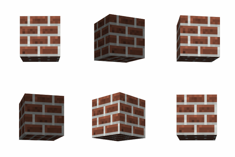
4. **Create responsively resizing cubes!** — Really easy with the surprisingly well supported CSS [viewport units](http://caniuse.com/#search=viewport%20unit).
```css
/* This responsive cube will be 25% of the viewport width */
.my-viewport-responsive-cube {
width: 25vw;
height: 25vw; /* Cubes need 1:1 ratio! */
}
```
For more conventional responsive design, you can set your cube's width and height to a percentage of its parent element. (By default, `.qube` is actually 100% width and 100% height.) _However,_ some care must be taken to make sure that the container element maintains a 1:1 aspect ratio.
```html
... faces ...
```
```css
.one-half {
position: relative;
width: 50%;
padding-top: 100%;
/* Sets height to 100% of width, forcing a 1:1 aspect ratio */
}
.one-half .qube {
/* Center this cube in the parent */
position: absolute;
left: 0;
right: 0;
top: 0;
bottom: 0;
margin: auto;
/* Each of this cube's faces will be
a responsive 25% of the parent */
width: 25%;
height: 25%;
}
```
5. **Easily rotate your cube along the X, Y, or Z-axis!** — Your cube will neatly rotate about its center.
```css
.my-cube {
transition: transform 1500ms ease;
}
.my-cube:hover {
transform: rotateY(359deg);
}
```
6. **Optionally, you can skip the face name classes.** — Use `.qube.faces` to turn your elements into faces automatically. **Note:** This _does_ dictate the source order of your cube faces.
```html
- My front
- My left
- My back
- My right
- My top
- My bottom
```
7. **Handy utilities and optimizations!** — Use `.qube-perspective` on a parent element to setup your 3D viewport. Use `.qube-preserve3d` as a shortcut if you need it. Use `.qube.solid` as an optimization when your cube is not semi-transparent, and you are not displaying the inside of your cube.
8. **Customize individual cube faces!** — It's a snap to change the color or other styles of a single cube face. You can even skip a cube face so people can peek inside.
```css
/* Make just the front blue */
.my-cube > .front {
background: blue;
}
```
```html
-
-
-
-
-
```
### Usage
Download this GitHub project, add the `"src/qube.css"` or `"src/qube.min.css"` CSS file to your project, and include the file in your ``.
```html
```
Define your cube using your preferred markup. **Note:** If you do not use `.qube-perspective` it will be important to establish your own CSS `perspective` settings or your cubes will look flat.
```html
Hey!
Howdy!
Hi!
Hello!
Foo
Bar
```
Style your cube.
```css
/* Create a 200 by 200 by 200px cube... */
.my-cube {
width: 200px;
height: 200px;
/* (It is a CUBE, so the width/height are EQUAL.) */
}
/* ...that is red. */
.my-cube > * {
background: #f00;
}
```
### Browser Support
* Tested in Chrome 16+, Firefox 10+, Safari 5+, Android 3+, and iOS 4+
* Compatible with browsers that fully support [CSS3 3D Transforms](http://caniuse.com/#search=3d%20transform).
### Intro to 3D CSS3 (Helpful Prerequisites)
I recommend that you read this very helpful [intro to 3D CSS3 properties](http://24ways.org/2010/intro-to-css-3d-transforms) and this [CSS cube reference](http://desandro.github.io/3dtransforms/docs/cube.html). You are going to have a lot fewer headaches if you already understand how and when to use these CSS properties:
* `perspective: 1234px;`
* `transform-style: preserve-3d;`
* `transform: translateZ(0);`
### Change Log
**2015-03-04**
* GitHub Release
### Author / License ##
This project was created by Zachary Johnson. You can find him on Twitter [@zacharyjohnson](http://twitter.com/zacharyjohnson) and also at [zachstronaut.com](http://www.zachstronaut.com/).
This code is released under an MIT style license. See `LICENSE.txt`.