https://github.com/zestfulnation/vue-hotel-datepicker
A VueJS v2 responsive date range picker. Displays the number of nights selected and allow several useful options like custom check-in/check-out rules, localization support and more.
https://github.com/zestfulnation/vue-hotel-datepicker
calendar datepicker datepicker-component vue vuejs vuejs-components vuejs-plugin vuejs2
Last synced: about 1 month ago
JSON representation
A VueJS v2 responsive date range picker. Displays the number of nights selected and allow several useful options like custom check-in/check-out rules, localization support and more.
- Host: GitHub
- URL: https://github.com/zestfulnation/vue-hotel-datepicker
- Owner: ZestfulNation
- License: mit
- Created: 2017-06-27T15:35:46.000Z (almost 8 years ago)
- Default Branch: main
- Last Pushed: 2024-05-22T15:49:21.000Z (about 1 year ago)
- Last Synced: 2025-05-08T22:07:24.110Z (about 2 months ago)
- Topics: calendar, datepicker, datepicker-component, vue, vuejs, vuejs-components, vuejs-plugin, vuejs2
- Language: Vue
- Homepage: https://zestfulnation.github.io/vue-hotel-datepicker/
- Size: 8.02 MB
- Stars: 840
- Watchers: 25
- Forks: 215
- Open Issues: 3
-
Metadata Files:
- Readme: README.md
- Changelog: CHANGELOG.md
- Contributing: CONTRIBUTING.md
- License: LICENSE
- Code of conduct: CODE_OF_CONDUCT.md
Awesome Lists containing this project
README
[](vue-hotel-datepicker)
[](https://travis-ci.org/krystalcampioni/vue-hotel-datepicker)
A responsive date range picker for Vue.js that displays the number of nights selected and allow several useful options like custom check-in/check-out rules, localization support and more.
## Demo
[https://ZestfulNation.github.io/vue-hotel-datepicker/](https://ZestfulNation.github.io/vue-hotel-datepicker/)
## Installation
#### NPM
```bash
npm install vue-hotel-datepicker
```
#### PNPM
```bash
pnpm install vue-hotel-datepicker
```
#### YARN
```bash
yarn add vue-hotel-datepicker
```
```javascript
import HotelDatePicker from 'vue-hotel-datepicker'
import 'vue-hotel-datepicker/dist/vueHotelDatepicker.css';
export default {
components: {
HotelDatePicker,
},
}
```
```html
```
## Props/Options
| Name | Type | Default | Description |
|--|--|--|--|
|**alwaysVisible**|`Boolean`|`false`|If true shows display calendar in the page without an input.
|**bookings**|`Array`|`[]`|If you want to show bookings.
|**closeDatepickerOnClickOutside**|`Boolean`|`true`|Closes the date picker when the user clicks outside the date picker.
|**disableCheckoutOnCheckin**|`Boolean`|`false`|If set to true, disable checkout on the same date has checkin.
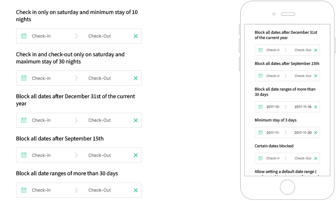
|**disabledDates**|`Array`|`[]`|An array of strings in this format: `YYYY-MM-DD`. All the dates passed to the list will be disabled.
|**disabledDaysOfWeek**|`Array`|`[]`| **DEPRECATED**: An array of strings in this format: `['Monday', 'Tuesday', 'Wednesday', 'Thursday', 'Friday', 'Saturday', 'Sunday']`. All the days passed to the list will be disabled. It depends on the translated names.
|**disabledWeekDays**|`Object`|`{}`| An object with the following properties: `sunday`, `monday`, `tuesday`, `wednesday`, `thursday`, `friday`, `saturday`, the value indicates if that day is disabled (true) or enabled (false).
|**displayClearButton**|`Boolean`|`true`|If set to true, displays a clear button on the right side of the input if there are dates set.
|**enableCheckout**|`Boolean`|`false`|If `true`, allows the checkout on a disabled date.
|**endDate**|`[Date, String, Number]`|`Infinity`|The end view date. All the dates after this date will be disabled.
|**endingDateValue**|`Date`|`null`|The initial value of the end date.
|**firstDayOfWeek**|`Number`|`0`|The first day of the week. Where Sun = 0, Mon = 1, ... Sat = 6. You need to set the right order in `i18n.day-names` too.
|**format**|`String`|`'YYYY-MM-DD'`|The date format string.
|**gridStyle**|`Boolean`|`true`|If false hides the grid around the days.
|**halfDay**|`Boolean`|`true`|Allows to have half a day, if you have check in at noon and checkout before noon
|**hoveringTooltip**|`[Boolean, Function]`|`true`|Shows a tooltip with the number of nights when hovering a date.
|**i18n**|`Object`| see below | Holds the traslation of the date picker.
|**lastDateAvailable**|`[Number, Date]`|`Infinity`|Allows to stop calendar pagination after the month of that date
|**maxNights**|`Number`|`null`|Maximum nights required to select a range of dates. `0` or `null` for no limit.
|**minNights**|`Number`|`1`|Minimum nights required to select a range of dates.
|**periodDates**|`Array`| `[]` | If you want to have specific startAt and endAt period with different duration or price or type of period. See below for more information
|**positionRight**|`Boolean`|`false`|If true shows the calendar on the **right** of the input.
|**priceDecimals**|`Number`|`0`|The price decimals for weekly periods (see `periodDates`).
|**priceSymbol**|`String`|`''`|The price symbol added before the price when `showPrice` is true and a `price` has been set in one of the `periodDates` array items (period).
|**showPrice**|`Boolean`|`false`|If set to true, displays a price contains on your `periodDates`.
|**showSingleMonth**|`Boolean`|`false`|If set to true, display one month only.
|**showWeekNumbers**|`Boolean`|`false`|If set to true, displays the week numbers.
|**showYear**|`Boolean`|`true`|Shows the year next to the month.
|**singleDaySelection**|`Boolean`|`false`|When true only one day can be selected instead of a range.
|**startDate**|`[Date, String]`|`new Date()`|The start view date. All the dates before this date will be disabled.
|**startingDateValue**|`Date`|`null`|The initial value of the start date.
|**tooltipMessage**|`String`|`null`|If provided, it will override the default tooltip "X nights" with the text provided. You can use HTML in the string.
|**value**|`Boolean`|`false`| The v-model prop, controls the visibility of the date picker.
|**yearBeforeMonth**|`Boolean`|`false`| Show the year before the month, only when showYear is true.
## i18n Defaults:
```js
i18n: {
"night": "Night",
"nights": "Nights",
"week": "week",
"weeks": "weeks",
"day-names": ["Sun", "Mon", "Tue", "Wed", "Thur", "Fri", "Sat"],
"check-in": "Check-in",
"check-out": "Check-out",
"month-names": [
"January",
"February",
"March",
"April",
"May",
"June",
"July",
"August",
"September",
"October",
"November",
"December",
],
"tooltip": {
"halfDayCheckIn": "Available CheckIn",
"halfDayCheckOut": "Available CheckOut",
"saturdayToSaturday": "Only Saturday to Saturday",
"sundayToSunday": "Only Sunday to Sunday",
"minimumRequiredPeriod": "%{minNightInPeriod} %{night} minimum.",
},
}
```
## periodDates
- Type: `Array`
- Default: `[]`
If you want to have specific startAt and endAt period with different duration or price or type of period-
Key | Type | Description
-------------------------------------|------------|-------------------------
endAt | String | YYYY-MM-DD
startAt | String | YYYY-MM-DD
minimumDuration | Number | Minimum stay (Type: weekly => per_week \| Type: nightly => per night)
periodType | String | *nightly*, *weekly_by_saturday*, *weekly_by_sunday*
price | Float | Price displayed on each day for this period
**Example:**
```js
periodDates: [
{
startAt: "2020-06-09",
endAt: "2020-07-26",
minimumDuration: 4,
periodType: "nightly"
},
{
startAt: "2020-07-26",
endAt: "2020-09-30",
minimumDuration: 1,
periodType: "weekly_by_saturday"
},
{
startAt: "2020-09-30",
endAt: "2020-11-30",
minimumDuration: 2,
periodType: "weekly_by_sunday",
price: 4000.0
}
],
```
#### `MinimumDuration` with a periodType `weekly-~` equals to a week
## bookings
If you want to show bookings
- Type: `Array`
- Default: `[]`
Key | Type | Description
-----------------|-------------|-------------------------
`checkInDate` | `String` | `'YYYY-MM-DD'`
`checkOutDate` | `String` | `'YYYY-MM-DD'`
`style` | `Object` | Style, (see the example)
**Example:**
```js
bookings: [
{
event: true,
checkInDate: "2020-08-26",
checkOutDate: "2020-08-29",
style: {
backgroundColor: "#399694"
}
},
{
event: false,
checkInDate: "2020-07-01",
checkOutDate: "2020-07-08",
style: {
backgroundColor: "#9DC1C9"
}
}
],
```
## Methods
⚠️ In order to open/close the datepicker from an external element, such as a button make sure to set `closeDatepickerOnClickOutside` to `false`
| Name | Description |
|--|--|
|`hideDatepicker` | Hides the datepicker
|`showDatepicker` | Shows the datepicker
|`toggleDatepicker`| Toggles (shows or hides) the datepicker
## Events
| Name | Params enum | Description |
|--|--|--|
|`booking-clicked`|`MouseEvent`, `Date`, `Object`|Emitted every time a booking is clicked. The first param is the mouse javascript event, the second is the clicked Date and the third is the clicked booking.
|`check-in-changed`| | Emitted every time a new check in date is selected with the new date as payload.
|`check-out-changed`| | Emitted every time a new check out date is selected with the new date as payload.
|`clear-selection`| | Emitted every time you clicked on clear Date button.
|`day-clicked`| `Date`, `String`, `Date\|Number\|String` | Emitted every time when day is clicked. The params are clicked: date, format and next disabled date.
|`handle-checkin-checkout-half-day`| `Object` | Emitted on [`beforeMount`, `clear-selection`, `checkout`]. Param: Object of checkin-checkout date.
|`next-month-rendered`| | Emitted every time the next month is rendered.
|`period-selected`| `Event`, `Date`, `Date` | Emitted every time when a checkOut is clicked. Params: Mouse Event, checkIn, checkOut
### `booking-clicked` examples
```js
{
checkInDate: "YYYY-MM-DD",
checkOutDate: "YYYY-MM-DD",
style: {
backgroundColor: "#399694",
}
}
```
## Credits
This component was originally built as a Vue wrapper component for the [Hotel Datepicker](https://github.com/benitolopez/hotel-datepicker) by @benitolopez. Version 2.0.0 was completely rewritten with Vue, removing the original library, removing some features and introducing others.