https://github.com/zesty-io/module-bootstrap5
Module Bootstrap 5 Framework
https://github.com/zesty-io/module-bootstrap5
Last synced: 6 months ago
JSON representation
Module Bootstrap 5 Framework
- Host: GitHub
- URL: https://github.com/zesty-io/module-bootstrap5
- Owner: zesty-io
- Created: 2023-02-03T13:59:42.000Z (over 3 years ago)
- Default Branch: main
- Last Pushed: 2023-02-22T12:01:13.000Z (over 3 years ago)
- Last Synced: 2025-06-17T23:38:39.258Z (about 1 year ago)
- Language: SCSS
- Size: 112 KB
- Stars: 0
- Watchers: 3
- Forks: 2
- Open Issues: 1
-
Metadata Files:
- Readme: README.md
Awesome Lists containing this project
README
# module-bootstrap5
This module is meant for  Zesty's modules
that is using  Bootstrap framework. Because it allows users to customize basic bootstrap default stylings such as: **Basic Font Stylings**, **Headers**, **Hyperlinks** and **Theme Colors**.
> **Warning**: Installing this module may affect existing content models that are using bootstrap stylings. Since the default bootstrap files will automatically be installed in the instance.
> In the **Zesty Instance Manager**, click **Settings** and choose under **WebEngine Styles & Fonts**

📝Some of the styling section may be [empty](https://user-images.githubusercontent.com/55866499/217271136-dafc9539-c807-4dc5-af81-30b0381f58e5.png), you may also add your own **"Style Variable"** settings using [Instance API](https://instances-api.zesty.org/#e90fa093-5d07-4ddb-a854-e1ec15701f47).
What is Style Variables?
> This variables are used as reference in the stylesheets which allows users to change the styles of the web page dynamically. Click [here](https://zesty.org/services/manager-ui/settings/less-variables#what-are-style-variables) to know more about Style Variables.
### 1. Body Colors & Spacing
> The bootstrap theme colors:`Primary` `Secondary` `Light` `Dark` can be customized in this section using Color Picker. Color such as: `Accent1` `Accent2` are the style variables for Theme Colors **Success** and **Info**

💡The styling will only apply to elements that has theme color classes. For example: `class="text-primary"` `class="bg-dark"`.
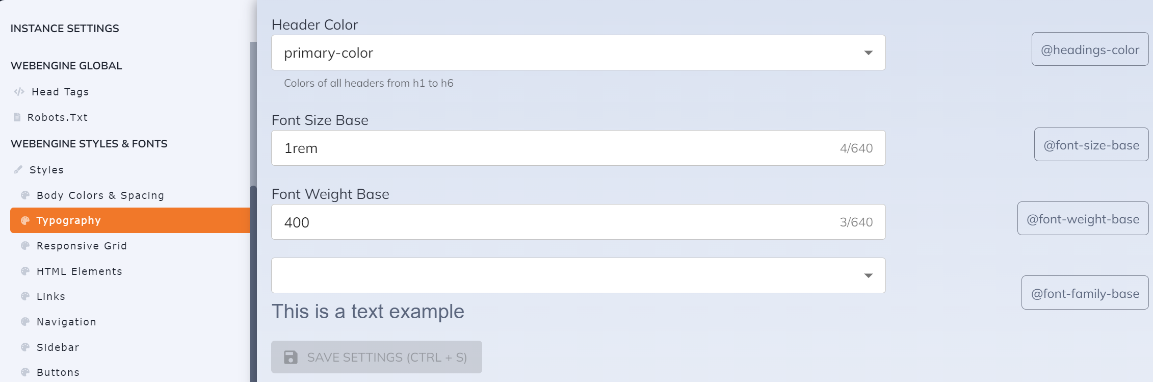
### 2. Typography
> In this section, you can customize basic font stylings for all texts including all headers.
#### 2.1 Installing Fonts
> To install a font, Under **Fonts** section click **Browse Fonts**

>Choose a font style with sets of font weight e.g (400, 500, 700) that will be included in the installation.

> Scroll to the right side of the panel then click **Add** to apply the selected font.

> Go to **Installed Fonts** to see the fonts that are installed in the instance
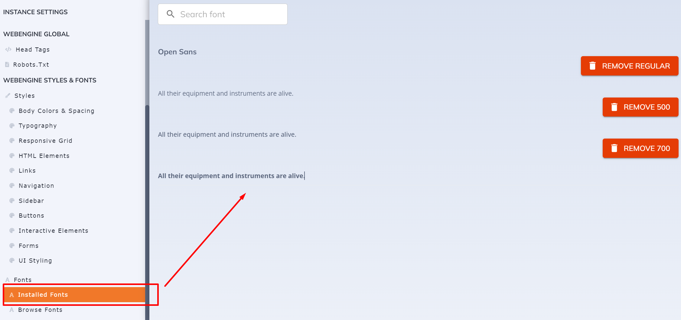
> All installed fonts will be available as an option to all settings with font picker.
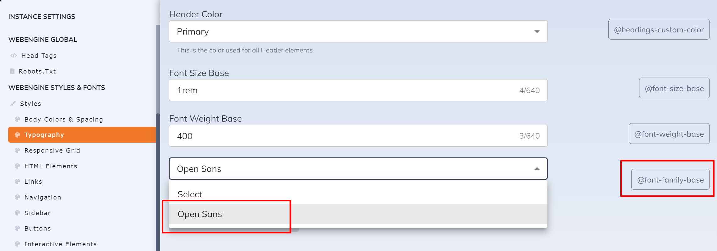
💡Font will not be available in the **Typography** settings when its not yet installed. Font should be installed first in order to be available as a dropdown option in the settings.
### 3. Links
> Hyperlinks stylings in the web page can be customized in this section including basic hyperlinks properties such as: hover, clicked and visited.

>💡Font colors settings only apply to default elements (without class).
> All color settings will based on the `Bootstrap Theme colors` from **Body Colors and Spacing** section