https://github.com/zillionare/slidev-theme-rich
A Slidev theme that offers rich UI components and stunning visual effects.
https://github.com/zillionare/slidev-theme-rich
awesome powerpoint slidev slidev-them-rich slidev-theme template visual-effects
Last synced: 8 months ago
JSON representation
A Slidev theme that offers rich UI components and stunning visual effects.
- Host: GitHub
- URL: https://github.com/zillionare/slidev-theme-rich
- Owner: zillionare
- Created: 2024-06-29T14:11:10.000Z (almost 2 years ago)
- Default Branch: main
- Last Pushed: 2024-07-06T09:46:53.000Z (almost 2 years ago)
- Last Synced: 2024-12-28T02:44:30.359Z (over 1 year ago)
- Topics: awesome, powerpoint, slidev, slidev-them-rich, slidev-theme, template, visual-effects
- Language: Vue
- Homepage: https://zillionare.github.io/slidev-theme-rich/
- Size: 2.21 MB
- Stars: 3
- Watchers: 1
- Forks: 0
- Open Issues: 0
-
Metadata Files:
- Readme: README-cn.md
Awesome Lists containing this project
README
# Slidev-theme-rich
[English](README.md)
▶️▶️[Live demo](https://zillionare.github.io/slidev-theme-rich/)
[Github](https://github.com/zillionare/slidev-theme-rich)
[](https://www.npmjs.com/package/slidev-theme-rich)
Rich是一个Slidev主题,它提供丰富的UI组件和令人惊叹的视觉效果。

关于Slidev,请参考[Slidev](https://github.com/slidevjs/slidev).
[在线演示](https://zillionare.github.io/slidev-theme-rich/)
## 🛠 安装
将以下 frontmatter 添加到您的 `slides.md` 中。启动Slidev然后它会提示你自动安装本主题。
```yaml
theme: rich
```
对于主题提供的内容,您可以参考 [Demo](https://zillionare.github.io/slidev-theme-rich)以了解有关如何使用主题的更多信息。
## 💼布局
该主题提供以下布局:
### cover

对于其他布局,只需使用内置的 Slidev 即可。
## 🧩 components
**提示:几乎每个组件都支持 v-motion,因此您不必另外声明。**
该主题提供以下组件:
### Device Mockup

由 Devices.css 提供支持,支持 10 多种设备,包括 iPhone、Macbook、iMac、Galaxy、Google Pixels、Apple-Watch 等。
#### props
这些组件接受以下属性:
| name | type | default | description |
| ----- | ------ | ------- | --------------------------------------------------- |
| kind | String | None | The name of the device, for example, iphone-14-pro. |
| scale | Number | 1 | to scale the mockup |
更多设备名请参考devices.css的文档
#### Styling
您可以向组件添加 unocss 指令,即类似 `class="absolute left-50px"` 的指令来调整位置和大小。
```html
```
未使用的属性将传递给子元素,在本例中,它是视频,主题提供的另一个组件。
您还可以添加特定的样式,就像第 3 行那样。
**请注意,这里我们使用了 `abs` 而不是 `absolute` 。这是一个与后者完全相同的类,但书写起来更简洁**
#### 用法示例
```html
```
在示例中,我们只是将视频放入设备的屏幕中。但实际上,任何有效的 html/markdown 内容都可以。
### Anime
Animate.css提供了几十种简单但常用的动画。但直接使用它并不方便,比如需要额外引入css文件,样式声明较长、不易记;如果是退出效果,动画在退出动作执行完之后,仍然会回到原始状态等等。
我们提供Anime这个组件,以便可以更容易地使用Animate.css。
#### props
| name | type | default | description |
| ------ | --------------------- | ------- | -------------------------------------------------------- |
| action | String | '' | 必须提供,动画名称 |
| dur | String | 1s | 动画持续时间 |
| delay | String | 0ms | 允许实现延迟加载 |
| at | Number, Array[Number] | -1 | 只在at指定的$clicks时加显示本组件。-1意味着与$clicks无关 |
#### Style
无特殊样式。调用者传入的样式会绑定到组件上。
#### 用法示例
```
Bounce me
```
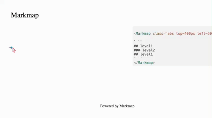
### Markmap
以交互方式显示演示文稿的议程和目录。

#### props
| 名称 | 类型 | 默认 | 描述 |
| ---------------- | ------- | ---- | ---------------------------------- |
| colorFreezeLevel | number | 3 | 在哪个级别之后,标记图将冻结颜色图 |
| duration | 数字 | 200 | 展开/折叠节点时的动画持续时间 |
| maxWidth | number | 0 | 标记图的最大宽度 |
| ExpandLevel | number | -1 | 启动时级别会扩展。 -1 表示展开全部 |
| Zoom | boolean | true | 允许缩放 |
| pan | boolean | true | 显示控制面板 |
#### Styling
使用通用 unocss 指令来控制组件的位置和大小。
#### 用法示例
```html
` ``
## level1
### level2
## level1
` ``
```
确保将您的内容封装到一对“\`\`\`”(三个backtits)指令中。
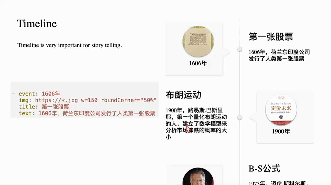
### Timeline
Timeline是故事叙述的好帮手。

您通过yaml语法来定义时间轴。其语法是:
```yaml
- event: 1606年
img: https://*.jpg w=150 roundCorner="50%" shadow="0 2px 5px rgba(0, 0, 0, 0.5)"
title: 第一张股票
text: 1606年,荷兰东印度公司发行了人类第一张股票
```
每一项都有event,img, title,subtitle,text来组成。subtitle和text可以省略。
img字段允许添加参数以指定大小、是否圆角和添加阴影。
使用方法:
```md
your yaml content here
```
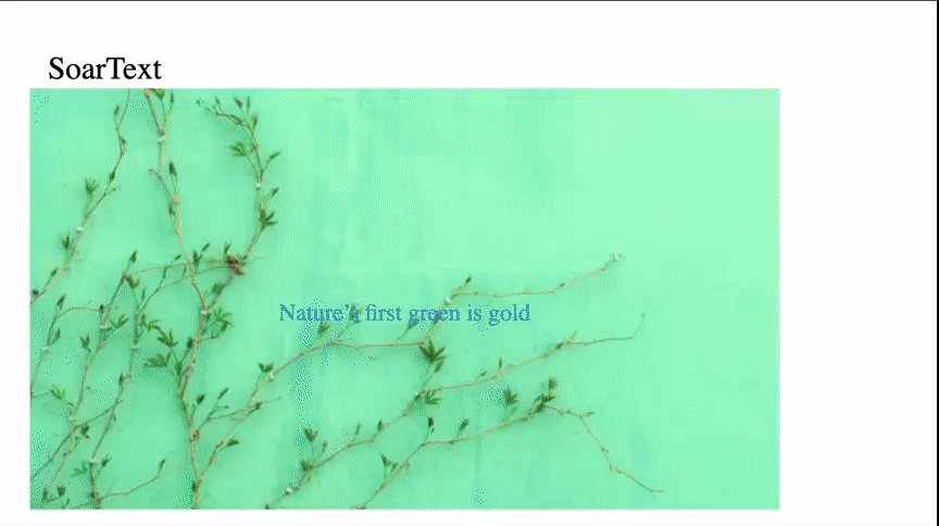
### SoarText
如果你只有很少几张图,要通过slidev录制一个好的视频,SoarText将是好帮手。它通过把字幕动画化,弥补了视觉元素的不足。
使用方法:
```md
your subtitles here
```
SoarText的内容通过markdown来指定:
```md
Nature’s first green is goldhttps://images.unsplash.com/photo-1555465910-31f7f20a184d?q=80&w=600
Her hardest hue to hold
Her early leaf’s a flowerhttps://images.unsplash.com/photo-1478217655296-6ca53ca4b677?w=800
But only so an hour
Then leaf subsides to leaf
So Eden sank to grief
So dawn goes down to day
Nothing gold can stay
```
每一行将在屏幕上作为一个独立的显示部分,当文本较多时,自动缩小字体,反之,自动放大字体。它由文本及背景指标组成。背景可以指定为一张图片。它与显示文本间通过来分隔。
### Card
一个好的 PowerPoint 演示文稿应尽量使用最少的文本。如果需要文本,则应对其进行有效组织。这就是为什么我们需要 Card 组件。
最初的版本提供了三种卡,naive卡、profile卡和Scard卡。

正如屏幕截图所示,一张简单的卡片就像一个 CSS 框一样简单。
#### props
| name | type | default | description |
| ------------- | ------- | ---------------- | ------------------------------------------------------ |
| title | string | None | if provided, the card will contains a title |
| titleAlign | string | left | controls how the title aligned horizontally. |
| contentAlign | string | justify | controls how the main content aligns. |
| gradientTitle | boolean | false | if true, a gradient background is drawed at title area |
| color | string | rgb(223,248,251) | the title's background color |
| titleFont | string | 20px | font size of the title |
#### Styling
使用通用 unocss 指令来控制组件的位置和大小。
#### 用法示例
```html
this is naive card with a Title.
v-motion is supported out-of-box.

this is Card without a Title
```
### Profile

使用此组件来显示人员的个人资料。它需要一个头像img src,如果没有提供,只需使用数字,然后它可以用作带有步骤的列表。
#### props
| name | type | default | description |
| --------- | ------ | ------- | -------------------------------- |
| headerImg | string | None | 必填,标题背景图片的src |
| avatar | string | None | 头像图片的src |
| w | string | 300px | 盒子的宽度 |
| h | string | 450px | 高度框 |
| fontSize | string | 14px | 字体大小 |
| seq | string | 1 | 序列号。如果头像存在则将被忽略。 |
#### Styling
使用通用 unocss 指令来控制组件的位置和大小。
#### 用法示例
```html
### Aaron
Course Instructor
```
### Scard

Card变体的另一个例子。背景和正文被S型曲线分开。
#### props
| 名称 | 类型 | 默认 | 描述 |
| ------------- | ------ | ----- | ---------------------------------------------------------- |
| w | 字符串 | 300px | 卡片的宽度 |
| h | 字符串 | 450px | 卡片的高度 |
| round | 字符串 | 10px | 卡片的半径 |
| contentHeight | 字符串 | 100% | 卡片的高度内容区域背景 |
| background | 字符串 | "" | 背景。如果未提供,则将按主题的primary/third 颜色来进行计算 |
#### Styling
除了 props 中列出的之外,其他部分可以通过通用 unocss 指令指定。
#### 用法示例
```html
the content of the box
the content of the box
```
### Floating Card
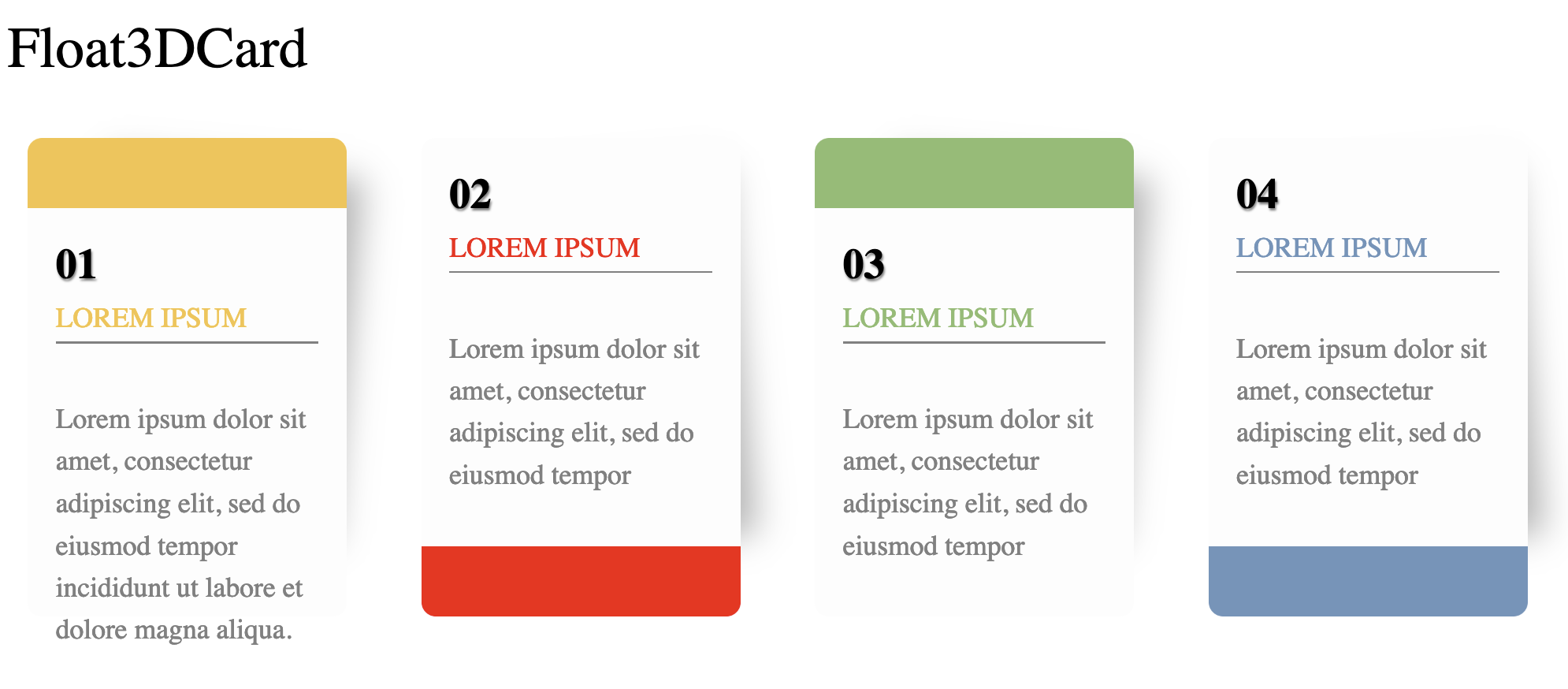
由一个序号、标题和描述文字组成。适合用于展示一个列表。
#### 用法示例
```
```yaml
color: "#F5C345"
capping: header
seq: "01"
title: LOREM IPSUM
desc: Lorem ipsum dolor sit amet, consectetur adipiscing elit, sed do eiusmod tempor incididunt ut labore et dolore magna aliqua.
```
### Audio
提供带有音量控制、基本淡入、淡出、延迟控制和预定义音频流集合的音频播放。
以下屏幕截图显示了内置音频列表:

#### props
| name | type | default | description |
| ------- | ------ | ------- | ----------------------------------------------------------------------------------------------------- |
| at | number | -1 | controls when the audio is played. It can be overridden by add `controls` attribute on the component. |
| name | string | None | required. The name of predefined audio, or the src url of the audio. |
| fadeOut | number | 0 | fadeOut time in milliseconds |
| fadeIn | number | 0 | fadeIn time in milliseconds |
| volume | number | 1 | the volume of the audio |
| delay | number | 0 | delay time in milliseconds |
#### Styling
不需要任何样式设计。默认情况下,当 `$slidev.nav.clicks` 等于 `:at` 时,Audio 组件将在后台自动播放,因此没有附加 UI。您可以将 `controls` 添加到其中,如下所示:
```vue
```
这将显示一个播放控制器。
#### 用法示例
```html
```
### Video
html 视频标签的简单包装。
#### props
name|type|default|description at|number|-1|控制何时显示视频。 -1 表示始终显示,只要页面存在,就始终显示。否则,仅当 `$slidev.nav.clicks` 等于 `at` 时才显示视频。 muted|boolean|false|控制视频是否静音 src|string|None|视频的 src
#### Styling
使用通用 unocss 指令来控制视频的位置和大小。
#### 用法示例
```html
```
## 🔌 插件
### Admonition

Admonition 是另一种卡片,但它是由 markdown-it 插件而不是组件渲染的。
用法示例:
```markdown
!!! tip
this is a tip admonition!
!!! quote
this is a quote/cite
```
### emoji图标
对于一小部分表情符号图标,您可以在 Markdown 内容中使用以下语法:
```md
- :smile: using icons is very simple, just write `:smile:`
- :heart: visit https://emojipedia.org/ for more emoji icons
```
正如示例所示,如果您不知道如何引用图标,请查看 https://emojipedia.org,如下截图所示:

**仅 Github 短代码有效**
## 参与开发
* `npm install`
*
`npm run dev` 开始 `example.md` 的主题预览
*
编辑 `example.md` 和样式以查看更改
*
`npm run export` 生成预览 PDF
*
`npm run screenshot` 生成预览 PNG
## History
### 0.3
- Released at July 5, 2024
- Features:
- Floating Card
- Fixed:
- markmap doesn't work when theme is installed from npmjs
### 0.2
- Release at July 4, 2024
- Features:
- SoarText
- Timeline
- Anime
- Fixed:
- Markmap在初次显示时,可能无法加载,需要刷新一次才能显示。
### 0.1
- Released at June, 2024
- Features:
- Device Mockup
- Markmap
- Card (naive and s-curve split card)
- Profile
- Audio
- Video
- Markdown admonition
- Emoji Icon