https://github.com/chrisuser/design-systems-diary
A collection of notes, tips and links regarding design systems and UI/UX development
https://github.com/chrisuser/design-systems-diary
List: design-systems-diary
awesome awesome-list design-systems from-zero-to-hero pattern-library ui ui-library ux-design
Last synced: 6 months ago
JSON representation
A collection of notes, tips and links regarding design systems and UI/UX development
- Host: GitHub
- URL: https://github.com/chrisuser/design-systems-diary
- Owner: ChrisUser
- License: mit
- Created: 2022-12-14T09:55:45.000Z (over 2 years ago)
- Default Branch: main
- Last Pushed: 2024-05-01T20:34:10.000Z (about 1 year ago)
- Last Synced: 2024-05-02T14:24:34.846Z (about 1 year ago)
- Topics: awesome, awesome-list, design-systems, from-zero-to-hero, pattern-library, ui, ui-library, ux-design
- Language: Markdown
- Homepage:
- Size: 607 KB
- Stars: 1
- Watchers: 1
- Forks: 0
- Open Issues: 0
-
Metadata Files:
- Readme: README.md
- Changelog: CHANGELOG.md
- License: LICENSE
Awesome Lists containing this project
- ultimate-awesome - design-systems-diary - A collection of notes, tips and links regarding design systems and UI/UX development. (Other Lists / Julia Lists)
README
A design systems diary

```diff
+ This is an ongoing project that needs constant revision so: contributions are welcome!
```
**How to contribute?**
If you know a resource or an interesting topic that isn't listed below nor detailed enough feel free to fork the project and to create a new [pull request](https://github.com/ChrisUser/design-systems-diary/pulls).
**Basic info**
All the provided links have been reviewed following this system:
| 😍 | 😮 | 😉 |
| :---------: | :-------------: | :------: |
| **Awesome** | **Interesting** | **Good** |
For some topics you will find the 🎁 icon indicating some fun practical resources[^1] to learn/understand faster the subject in question. Enjoy them and remember to **support the authors** if you can!
[^1]: If you are the creator/owner of a specific resource listed in this project and you wish to have the link removed you can open an issue with the **invalid** tag. Thank you in advance.
**What can be found inside this project?**
- [Colors](#colors)
- [Standards](#standards)
- [Accessibility](#accessibility)
- [Animations](#animations)
- [Documentation](#documentation)
- [Maintenance](#maintenance)
- [Feedback](#feedback)
- [Best practices](#best-practices)
**Articles that inspired this work:**
- [The self-taught UI/UX designer roadmap in 2021](https://bootcamp.uxdesign.cc/the-self-taught-ui-ux-designer-roadmap-in-2021-aa0f5b62cecb)
- [Atomic design by Brad Frost](https://bradfrost.com/blog/post/atomic-web-design/)
- [CSS architecture for design systems](https://bradfrost.com/blog/post/css-architecture-for-design-systems/)
---
## Colors
🎁 **Resources**
- [Create a palette with Coolors](https://coolors.co/generate)
- [Check your colors' contrast](https://contrastchecker.com/)
### Color meanings
The following table describes the positive and negative things associated[^2] with each listed color:
| **Color** | **Positive feeling / things** | **Negative feeling / things** |
| :-------: | :---------------------------------------------------------------------------- | :-------------------------------------------------- |
| Red | Power, passion, energy and excitement | Anger, emergency and rage |
| Orange | Happiness, sunshine and joy | Aggressivity, ignorance and deceit |
| Yellow | Happiness, intelligence and optimism | Caution, criticism, laziness and jealousy |
| Green | Nature, growth, harmony and money | Greed and lack of experience |
| Blue | Peace, calm, stability, expertise, trust and dependability | Depression, coldness and passiveness |
| Purple | Royalty, sophistication, luxury, wealth, spirituality, creativity and healing | Gloominess and sadness |
| Black | Power, elegance, professionalism and depth | Death, unknown, mystery, grief, mourning and sorrow |
| White | Purity, innocence, cleanliness and safety | Coldness and distance |
[^2]: Those are just a few of the possible associations. You can also find the same sentiment associated with more than one color.
### Color palette
> **Note**: A color palette, in the digital world, refers to the **full range of colors** that can be displayed on a device screen or other interface. The color palette **reveals a lot** about the electronic design of the device or technology, and its visual capabilities for human users.
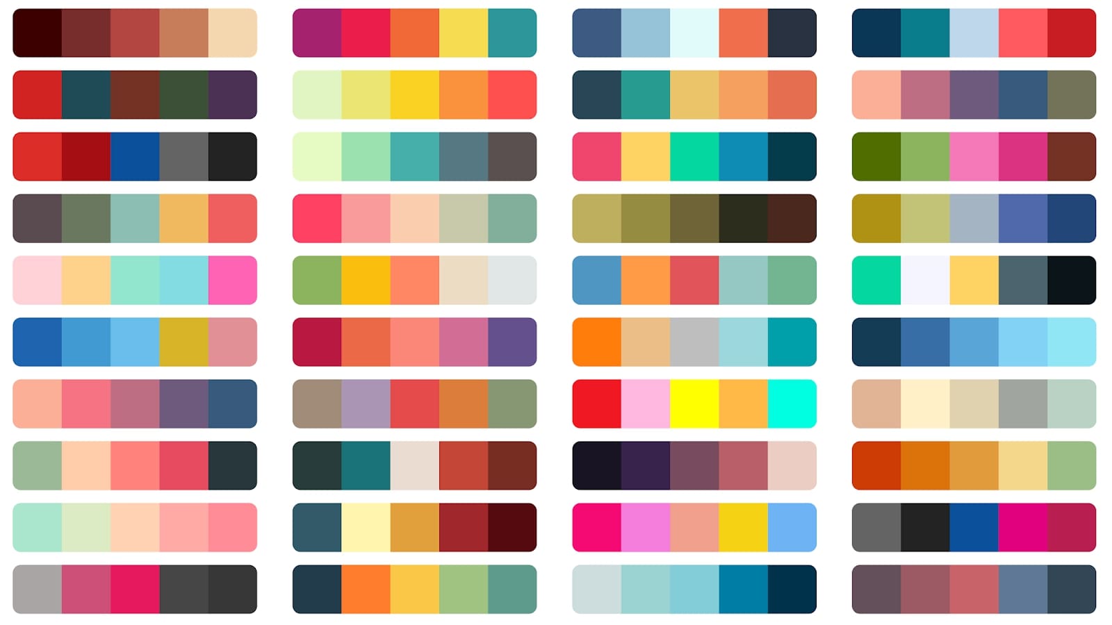
_Here you can see various examples of web color palettes with dark and light colors, ranging from blue to green and a little bit of red._
- [How to make your own color palettes](https://medium.com/@greggunn/how-to-make-your-own-color-palettes-712959fbf021)
- [How to Not Suck at Color](https://modus.medium.com/how-to-not-suck-at-color-b3980ee8084a)
---
## Standards
Standard and styleguides should be learned, understood, and implemented at **all times** on a project, and any deviation must be fully justified.
**Learn styleguides and standards:**
- [😍] [High-level advice and guidelines for writing sane, manageable, scalable CSS](https://cssguidelin.es/)
- [😍] [Schema.org - Create, maintain, and promote schemas for structured data on the internet](https://schema.org/docs/documents.html)
- [😮] [IEC - Product symbols standards](https://webstore.iec.ch/preview/info_iec60417iso7000_DB.pdf)
---
## Accessibility
> **Note**: "_Accessibility (often abbreviated to A11y — as in, "a", then 11 characters, and then "y") in web development means enabling as many people as possible to use websites, even when those people's abilities are limited in some way._" - [MDN web docs](https://developer.mozilla.org/en-US/docs/Web/Accessibility)
> **Note**: "_The Web is fundamentally designed to work for all people, whatever their hardware, software, language, location, or ability. When the Web meets this goal, it is accessible to people with a diverse range of hearing, movement, sight, and cognitive ability._" - [W3C - Accessibility](https://www.w3.org/standards/webdesign/accessibility)
🎁 **Resources**
- [Apple developer - Accessibility](https://developer.apple.com/design/human-interface-guidelines/accessibility)
- [A11y Mockups annotation kit](https://www.figma.com/community/file/953682768192596304)
**Learn accessibility standards:**
- [😍] [MDN - ARIA Attributes](https://developer.mozilla.org/en-US/docs/Web/Accessibility/ARIA/Attributes)
- [😍] [MDN - WAI-ARIA Roles](https://developer.mozilla.org/en-US/docs/Web/Accessibility/ARIA/Roles)
- [😍] [HTML : Importance of role for better voice-overs & accessibility](https://dev.to/rajeshkumaryadavdotcom/html-importance-of-role-for-better-voice-overs-accessibility-122a)
- [😮] [a11y-101](https://a11y-101.com/)
- [😮] [How to Create a “Skip to Content” Link for accessibility](https://css-tricks.com/how-to-create-a-skip-to-content-link/)
- [😉] [EAA Compliance for Websites:
The Definitive Guide](https://www.accessibilitychecker.org/guides/eaa-compliance/)
- [😉] [7 Ways to Make Your Website More Accessible](https://www.adaptworldwide.com/insights/2021/make-website-more-accessible)
**Best practices**
- Use a label with a `for` attribute for all the inputs in a form and show input's relative examples in the placeholders.
- Use a `` element to wrap radio buttons and a `` one to describe the choice.
- Use `` each time you want to have a button on the screen; try not to replace it with a generic `
` or other non specific elements.
- Use ``, ``, ``, `` and `` to define landmark regions inside your layouts.
- If you have a list of points/items in a page you should use `` or `` element to wrap each item and `- ` for every single child inside the list.
- `font-size` defined in rem is a better choice in terms of responsiveness and accessibility.
- Structure each section with headings using only one `` item per page and using consecutive headings numbers (``, ``, ...) inside each section.
- ARIA attributes could be used to fill the gap of accessibility features, interactions and roles (eg. if you use a `` instead of a `` to add a button inside a page); But: **Avoid using ARIA if a native HTML element can do the same job.**
- `aria-live` and `aria-controls` can be used to alert screen readers that something, after a user action, has been updated inside the current page; (see [MDN - aria-live](https://developer.mozilla.org/en-US/docs/Web/Accessibility/ARIA/Attributes/aria-live) & [MDN - aria-controls](https://developer.mozilla.org/en-US/docs/Web/Accessibility/ARIA/Attributes/aria-controls) to learn more).
- Programmable focus management is used to direct screen readers, or users in general, to a page update: opening of a modal, update of a previously disabled button after an action was performed, ...
- Use a "Skip to main content" link with a tabindex of 0 to be the first focusable element in a page full of text to make the user flow directly into the content.
---
## Animations
> **Note**: "_Not everyone likes decorative animations or transitions, and some users outright experience motion sickness when faced with parallax scrolling, zooming effects, and so on._" - [Thomas Steiner](https://web.dev/authors/thomassteiner/)
🎁 **Resources**
- [Easing functions](https://easings.net/)
- [bendc/easing.css](https://gist.github.com/bendc/ac03faac0bf2aee25b49e5fd260a727d)
- [Web Animation API - Browser support test](https://codepen.io/danwilson/pen/xGBKVq)
- [Web Animation API - caniuse](https://caniuse.com/web-animation)
- [😍] [MDN - Web Animations API](https://developer.mozilla.org/en-US/docs/Web/API/Web_Animations_API)
- [😍] [JavaScript Scroll Animation Tutorial: Web Animations API](https://www.youtube.com/watch?v=ZRCzvK4DnlA)
- [😍] [Animating Layouts with the FLIP Technique](https://css-tricks.com/animating-layouts-with-the-flip-technique/)
- [😮] [How to create high-performance CSS animations](https://web.dev/animations-guide/)
- [😮] [prefers-reduced-motion: Sometimes less movement is more](https://web.dev/prefers-reduced-motion/)
- [😉] [The Web Animations API vs. CSS](https://blog.logrocket.com/the-web-animations-api-vs-css/)
- [😉] [Orchestrating Complexity With Web Animations API](https://www.smashingmagazine.com/2021/09/orchestrating-complexity-web-animations-api/)
---
## Maintenance
🎁 **Resources**
- [Storybook](https://storybook.js.org/)
- [Storybook knobs - Dynamic props for your components](https://storybook.js.org/addons/storybook-addon-knobs-color-options)
- [Bit](https://bit.cloud/frontend-teams)
### Customer journey map
> **Note**: A customer journey map is a **diagram** (or several diagrams) that depict the stages customers go through when **interacting** with a company product or platform.

_Here you can see an example of a customer journey for an E-Commerce platform: the largest number of interactions are in the "Acquisition" stage. It also considers future user engagement touchpoints such as a newsletter._
- [😍] [User Journey vs User Flow: What’s the Difference and Why You Need Both?](https://userpilot.com/blog/user-journey-vs-user-flow/)
- [😍] [How to understand, use, and build customer journey maps](https://www.fullstory.com/customer-journey-maps/)
- [😍] [Don’t Make a Journey Map: 9 archetypes of good / bad, and how to decide what to use](https://medium.com/@shahrsays/dont-make-a-journey-map-9-archetypes-of-good-bad-and-how-to-decide-what-to-use-d65abd30ec6f)
- [😮] [The Practice of Customer-Journey Management](https://www.nngroup.com/articles/customer-journey-management/)
- [😮] [The Benefits and Disadvantages of Customer Journey Mapping](https://www.genroe.com/blog/benefits-and-disadvantages-of-customer-journey-mapping/15321)
- [😉] [Coursera - Creating User Journey Maps: A Guide](https://www.coursera.org/articles/creating-user-journey-maps-a-guide)
- [😉] [Techtarget - customer journey map](https://www.techtarget.com/searchcustomerexperience/definition/customer-journey-map)
**Pros**:
1. Gives us insight into users’ needs and which features to prioritize
2. Can be used as a **communication tool** across all the business teams
3. Decreases customer churn and increases customer lifetime value
**Cons**:
1. Needs to have very clear intent and a well defined scope level
2. Needs **cross-teams effort** and support to be implemented
3. Needs - "_quite a lot of_" - customers data to rely on
### Documentation
> **Note**: Documenting is a fundamental act to make sure that project requirements are **fulfilled** and to establish traceability concerning **what** has been done, **who** has done it, and **when** it has been done.
> 😉 **Hint**: To keep a history of the changes made on a project you should create a [CHANGELOG.md](https://github.com/ChrisUser/design-systems-diary/blob/main/CHANGELOG.md) file and keep it in the root folder of the project itself.
- [😍] [15 Essential Project Documents](https://www.projectmanager.com/blog/great-project-documentation)
- [😍] [Material UI (MUI) Official Website](https://mui.com/)
- [😍] [Storybook - How to document components](https://storybook.js.org/docs/react/writing-docs/introduction)
- [😮] [Project Documentation and Its Importance in 2023](https://www.simplilearn.com/project-documentation-article)
- [😮] [5 Ways to Document React Components in 2020](https://blog.bitsrc.io/5-ways-to-document-react-components-in-2020-ecf60f24dee8)
- [😉] [My component library documentation page](https://chrisuser.github.io/react-usage-bar/docs/)
**Pros**:
1. Gives all the designers and frontend devs a full comprehensive guide to use and understand the best scenarios for each component
2. Works as a **dynamic database** of assets, illustrations, components and compositions
**Cons**:
1. Needs to be maintained constantly over time for each small change made by everyone in the dev or design team
2. Can become too specific or complicated if there's **lack of communication** between the parts
### Testing
> **Note**: Without UX testing, it’s impossible to know if your products are **really meeting** the user’s needs and providing a positive experience.
- [😍] [15 Essential Project Documents](https://www.projectmanager.com/blog/great-project-documentation)
- [😮] [Project Documentation and Its Importance in 2023](https://www.simplilearn.com/project-documentation-article)
- [😮] [How to test UI components?](https://www.browserstack.com/guide/test-ui-components)
---
## Feedback
> _There’s no better time than now to start thinking about how happy your customers, clients, or your staff (or whoever you’re surveying) really are._
**Create a customer satisfaction survey:**
- [😍] [4 steps to customer survey design](https://getthematic.com/insights/customer-survey-design/)
- [😍] [Creating Customer Feedback Systems: A Step-By-Step Guide](https://userpilot.com/blog/customer-feedback-systems/)
- [😮] [Gathering feedback on your design system](https://zeroheight.com/help/guides/gathering-feedback-on-your-design-system/)
---
## Best practices
### Finally, a little "best practice dump":
- Always put lables or tooltips next to or near by icons in UI;
- Best text input width should be 80 characters;
- When designing a mobile UI adjust text size according to user distance from display;
- For long dropdowns add a filter box to the top so users can type and find elements quicker;
- Don’t force the user to search through a whole list of options, show the most popular choices at the top of the list;
- Avoid dropdowns if you only have 3-5 options available, a better solution is to use Radio buttons;
- Use `margin-inline-end` instead of `margin-right` to support rtl and ltr directions properties;
- To make gradients look subtle and **realistic**, you can use just one color on both ends. Then make one of the ends brighter by increasing Brightness (around 5 points) and decrease Hue (5 to 10 points);
- In dark mode avoid darker objects as top-layers. Anything that’s "closer" to the user should be lighter to show depth;
- Brightness difference between background and container should be: within _12%_ for dark interfaces and _7%_ for light ones;
- When having two buttons on a row: if you read left-to-right place the main action on the **right**;
- When having two buttons on a column: place the main action on the **bottom**;
- Always align the checkboxes to the top or bottom of the first line of text;
- ...
[⬆️ Back to top](https://github.com/ChrisUser/design-systems-diary?tab=readme-ov-file#a-design-systems-diary)